Navigate the Simplifile application
 Overview
Overview
The Simplifile application is an integrated web‑based application that uses a navigation menu, pages, windows, wizards, buttons, icons, links, menus, and items which let you interact with your Simplifile organizations, users, services, documents, and other items with which you have been authorized.
Use your mouse to traverse the Simplifile application navigation menu, pages, windows, and menus. Use your keyboard to make entries into fields as needed.
To help you quickly understand our Simplifile navigation terminology, we provided a brief Simplifile navigation terminology section below which is an alphabetical list of many of our navigation terms and their definitions.
I want to ...
I want to ...
Navigate the Simplifile application
Navigate the Simplifile application
- To open the various pages within the Simplifile application, select an item in the navigation menu or on a button, icon, or link within the pages in the right panel.
- To move about within a page or a window, move your mouse cursor to the location with which you want to interact and select the field, icon, button, or link.
Use the Actions dropdown button
Use the Actions dropdown button
IMPORTANT: Many pages contain an Actions  dropdown button. The actions displayed when the Actions dropdown button is selected and the associated to the page from which the button is selected. Not all pages' Actions dropdown button contain the same actions.
- From a page that has an Actions dropdown button, select the Actions dropdown button. A menu appears.
- Select the item you want to do.
- Complete the action as required.
Simplifile navigation terminology
Simplifile navigation terminology
button
In the Simplifile application, a “button” may be one of several things.
-
A button may be a graphical element with a distinct border that initiates an action. For example, the Save
 button.
 A button often (but not always) includes button name inside the button border and may or may not contain a symbol (or icon) inside the border.
In the documentation, this type of button is most often represented with its name in initial capital letter and bold. The word “button” may or may not be included in the text. For example, “Select the Save
 button”.
 -
A text button may be blue text with or without an icon that initiates an action. For example, the
 button.
In the documentation, this type of button is most often represented with its name in blue and often without the icon. For example, “Select the Register More Counties button.” The word “button” may or may not be included in the text. For example, “Select the Register More Counties button”.
-
An icon button may be only an icon that initiates an action. For example the Edit
 button. Some icons are just visual indicators and do not initiate an action.
In the documentation, when icons are used as buttons we usually include the function or name of the button in bold and the icon. For example, Select the Edit
 button, the Menu
  (ellipsis) button, and the Add
  button. Icon buttons may or may not be inside a border in the documentation.
Buttons and icon buttons differ from links in that links are often colored and underlined text and usually open web pages where buttons and icon buttons usually open pages, windows, or tools within the Simplifile application from which you may do an activity or activities. The blue underlined cross‑reference topic links in this Simplifile documentation are links.
Not all icons are buttons. Some icons are visual indicators or status or other properties that do not initiate an action.
Our buttons use two base colors; blue for primary actions, and a neutral color for secondary actions. Buttons may feature passive, hover, down, and disabled states.
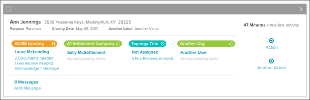
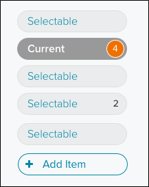
card view
Card views are a way we display data or content that would be difficult to in a list view (table). Often, card views are presented as a toggle option with a list view (table).
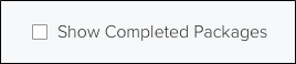
checkbox
Checkboxes are usually used for multi‑select interactions but can also be used when a single option state can be used. For example, a "Show Completed" checkbox control can be assumed to mean "Do not show Completed" when unchecked.
color usage
The user interface uses dedicated colors for specific meanings.
| Color | Meaning |
|---|---|
| Blue | Indicates an interaction, like a button. It also indicates a required item that one or more of your collaboration partners needs to address. |
| Orange | Indicates there is a required item that you need to address. |
| Green | Indicates success. |
| Aqua | indicates information. |
| Dark Blue | indicates links. |
| Red | indicates required element alerts. |
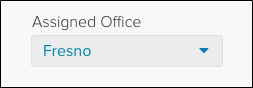
dropdown field
Dropdown fields are used to select an item from a predefined list, but can only show the selected option in it's static state.
disabled interface element
Disable buttons or other disabled interface elements are "dimmed" (not their usual brightness). When an interface element is dimmed, it is not accessible.
filter
In the Simplifile application, a “filter” is a set of parameters that must be met for the information to be displayed in a page or window. To help you quickly find the information and documents with which you work, you may create filters in many of the pages. Often a filter is represented by a Funnel  button. Selecting the Filter button opens a filter window from which you can choose your filter parameters.
icon
In the Simplifile application, an “icon” is a small graphical element usually without a border.
An icon may (but is not required to) display with its name in light blue. For example,  .
.
Some icons are visual indicators of status or other properties that do not initiate an action.
When an icon initiates an action it is also considered button.
In the documentation, when icons are used as buttons we usually include the function of the icon button in bold, the icon in parentheses, and the word “icon” or "button" may or may not be included in the text. For example, “Select the Edit  button.”
item
In the Simplifile application documentation we use the term "menu item" or "item" instead of "command" for items that are selected from various menus, dropdown lists, or rows in tables. In many cases, blue items are "active" (will do something when selected) and gray items are informational.
link
In the Simplifile application, a “link” is blue underlined text that opens another page either internal to or external to the documentation or a window. Many of the topics and tasks references in this Simplifile documentation are links.
list view (table)
List views are a way we display data or content that well suited to be displayed in a table. Often, list views are presented as a toggle option with a card view.
menu
In the Simplifile application, a “menu” is a list of items (often actions) that displays when some buttons (such as the Actions dropdown button or the Menu (ellipsis) button or dropdown lists are selected.
navigation menu
In the Simplifile application, the “navigation menu” is the gray bar in the left panel that is used to navigate Simplifile application pages.
The navigation menu items displayed to a user are determined by the by the organization, active services, roles, and permissions. The items in the navigation menu are not the same for all Simplifile users.
page
In the Simplifile application, a “page” is displayed to the right of the navigation menu. The information is usually related to the item selected in the navigation menu or from a link in another page.
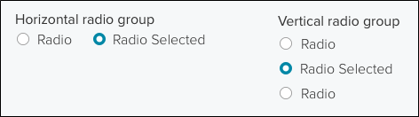
radio control (option)
A "radio control" (which we call an "option") only allows one of the options in the group to be selected.
Simplifile application
The web‑based user interface for the Simplifile product. The Simplifile application usually displays the “navigation menu” in the left panel and a “page” in the right panel.
window
In the Simplifile application, a “window” is a pop‑up form or message (also known as a "dialog box" or "dialog") that displays over a page which must be completed or closed before you can return to the page. A window often contain fields that can be edited. For example, the Simplifile Add User wizard uses multiple windows. Sometimes a window contains only information like a message. Close a window by completing the action, selecting the window’s Close  button, or selecting outside of the window’s borders.
wizard
In the Simplifile application, a “wizard” is a presentation of one or more windows where you enter information to complete an action or task (such as adding a user).