Customize Your Borrower Portal
You can customize and apply company branding. To get started, click Borrower Portal from the Website Builder drop-down.
 Preview Borrower Portal Pages
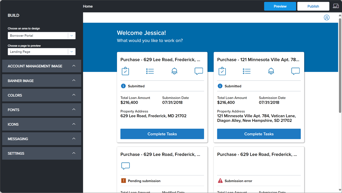
In the Borrower Portal, you can preview design changes in real time for the Landing (or Home) page, Tasks page, and Login page.
To Preview Borrower Portal Pages
-
Click Website Builder > Borrower Portal.
-
In the Choose a page to preview drop-down, click the page type (Landing Page, Tasks Page, Login Page).
Landing Page
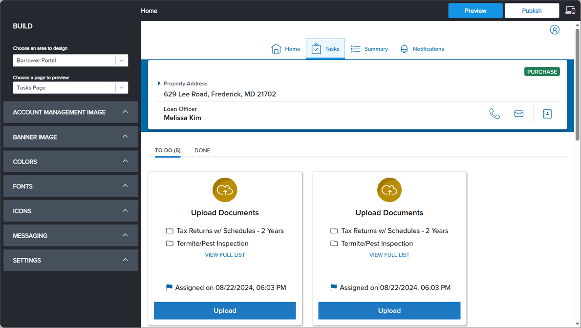
Tasks Page
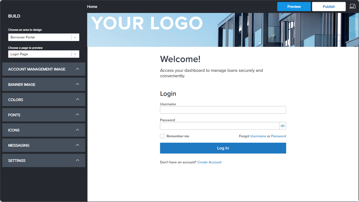
Login Page
Add or Change Account Management Image
The Account Management Image settings control the banner displayed at the top of the borrower portal Login Page.
To Add or Change Account Management Images
-
In Website Builder > Borrower Portal, expand Account Management Image.
-
To add or replace an image, click Add Image.
-
In the Add Image dialog, click the method to add the image (JPG, PNG, or GIF only).
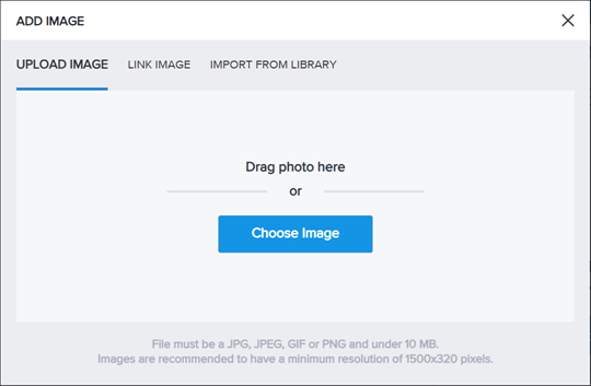
You can upload or select the new image, as described below.
-
Upload Image - Drag and drop your image file to the Upload Image box or click Choose Image and browse to an image on your system. When you upload an image, it is automatically added to the image library for your site.
-
Link Image - Type the URL of the image file into the Image URL text box. Linking icons does not save the icon in the icon library.
-
Import from Library - Select an image from the image library.
-
-
When updating an image, you do not have to first delete the image.
-
-
To set the overlay color, do the following:
-
Overlay Color. Click the color that displays over the entire image.
-
Overlay Opacity. Enter the percentage field of the color's transparency. The opacity is measured on a scale of 0 - 100%, where 0% is invisible and 100% is solid.
-
-
To revert any changes you made back to the default settings, select Reset to Default.
The Reset to Default link will only appear after you make changes.
-
Click Preview to see how the page will look to visitors on your site, then click Publish if you are ready to publish your changes.
Add or Change Banner Image
The Banner Image settings control the banner displayed at the top of the borrower portal.
To Add or Change Banner Images
-
In Website Builder > Borrower Portal, expand Banner Image.
-
To add or replace an image, click Add Image.
-
In the Add Image dialog, click the method to add the image (JPG, PNG, or GIF only).
You can upload or select the new image, as described below.
-
Upload Image - Drag and drop your image file to the Upload Image box or click Choose Image and browse to an image on your system. When you upload an image, it is automatically added to the image library for your site.
-
Link Image - Type the URL of the image file into the Image URL text box. Linking icons does not save the icon in the icon library.
-
Import from Library - Select an image from the image library.
-
-
When updating an image, you do not have to first delete the image.
-
-
To set the overlay color, do the following:
-
Overlay Color. Click the color that displays over the entire image.
-
Overlay Opacity. Enter the percentage field of the color's transparency. The opacity is measured on a scale of 0 - 100%, where 0% is invisible and 100% is solid.
-
-
To revert any changes you made back to the default settings, select Reset to Default.
The Reset to Default link will only appear after you make changes.
-
Click Preview to see how the page will look to visitors on your site, then click Publish if you are ready to publish your changes.
Change Color Settings
The Colors settings control the color of text, links, header, buttons, and brand color.
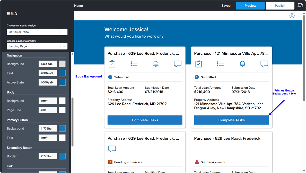
To Select Colors for Page Elements
-
In Website Builder > Borrower Portal, expand Colors.
-
In the Colors section, click the hex value or color swatch to adjust the color of the page element.
-
Header
Option Description Background
Background color of the header area where the company logo is displayed.
Shadow
Checkbox to display drop shadow under the header section.
-
Banner
Option Description Background
Background color of the banner.
-
Brand
Option Description Background
Background color of the section titles, information icons, and so on.
-
Navigation
Option Description Background
Background color of left navigation menu.
Text
Color of text on the navigation menu.
Active State
Color of the currently selected page on the navigation menu.
-
Body
Option Description Background
Background color of the borrower portal
Page Title
Color of title and subtitle under the header section.
-
Primary Button
Option Description Background
Background color of drop-down buttons and Next buttons.
Text
Color of text on primary buttons, such as the Next button.
-
Secondary Button
Option Description Border
Border and text color of secondary buttons, such as Yes, No, Previous, Save, and so on.
-
Link
Option Description Text
Color of text linked to a URL.
-
-
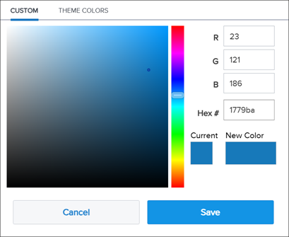
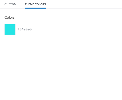
In the color selector dialog, click Custom or Theme Colors (if available).
-
Under the Custom tab, do the following:
-
In the color picker, click the color band and then click the color.
OR
In the RGB fields, enter the Red, Green, and Blue values.
OR
In Hex #, enter the hexadecimal color value, which is a six-digit code of letters and numbers.
-
Compare the Current color and the New Color.
-
Click Save.
-
-
Under the Theme Colors tab, locate and click the color from the list of theme colors used across other areas (Company Site, Loan Application, Borrower Portal).
By selecting from a list of theme colors used across other areas, you can ensure theming consistency.
-
-
To revert any changes you made back to the default settings, select Reset to Default.
The Reset to Default link will only appear after you make changes.
-
Click Preview to see how the page will look to visitors on your site, then click Publish if you are ready to publish your changes.
To Import Color Settings to Borrower Portal
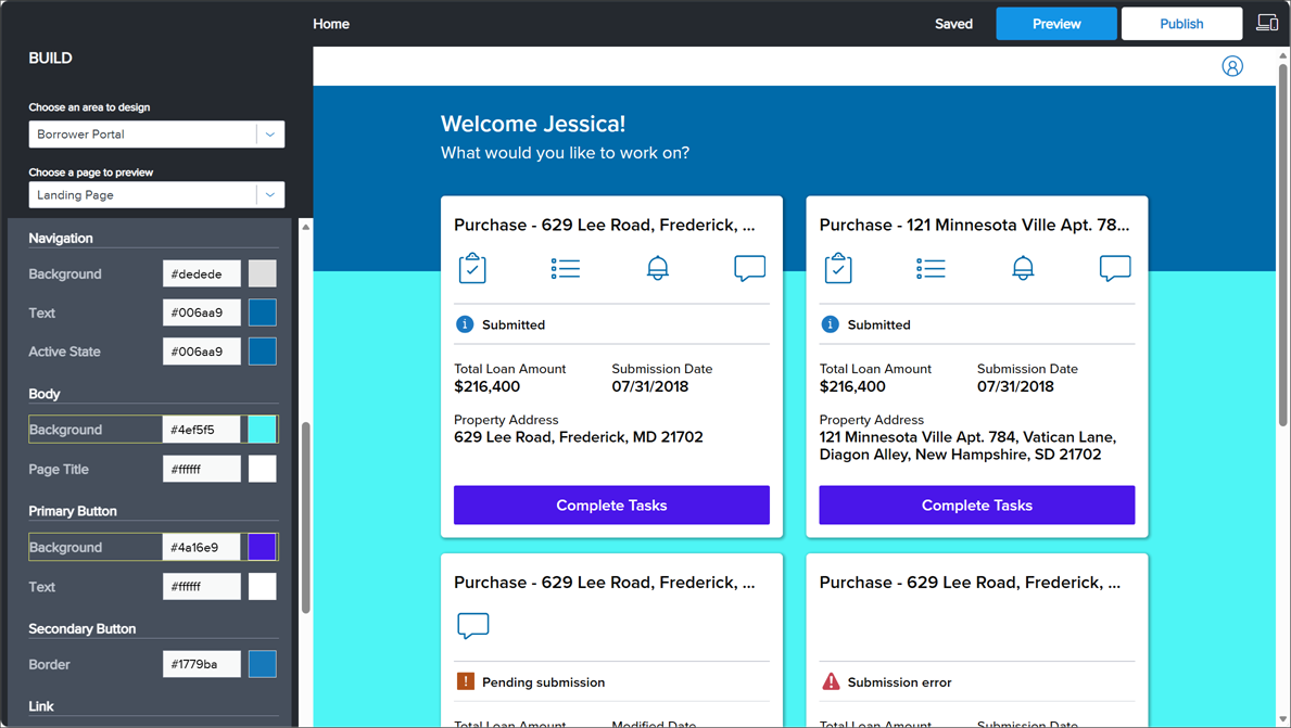
In the Borrower Portal, you can now apply Colors settings from your Company Site or Loan Application.
You will only be able to import color settings from an area's common page elements when the source colors have been changed from the default settings. For example, if all page element colors on Company Site are the default settings, you will not see or be able to click Company Site in the Theme drop-down.
-
In Website Builder > Borrower Portal, expand Colors.
-
In the Theme drop-down, click the import source (Company Site or Loan Application).
For Borrower Widget sites, the Theme drop-down will only show Loan Application as Company Sites do not apply to Widget site customers.
-
In the Confirmation prompt, click Yes. The updates are applied to page elements that are common between the two areas, and the updated page elements are indicated with a highlight box for easy identification.
-
To revert any changes you made back to the default settings, select Reset to Default.
The Reset to Default link will only appear after you make changes.
Choose Fonts
The Font settings control the font style and size of text, titles, and toast messages.
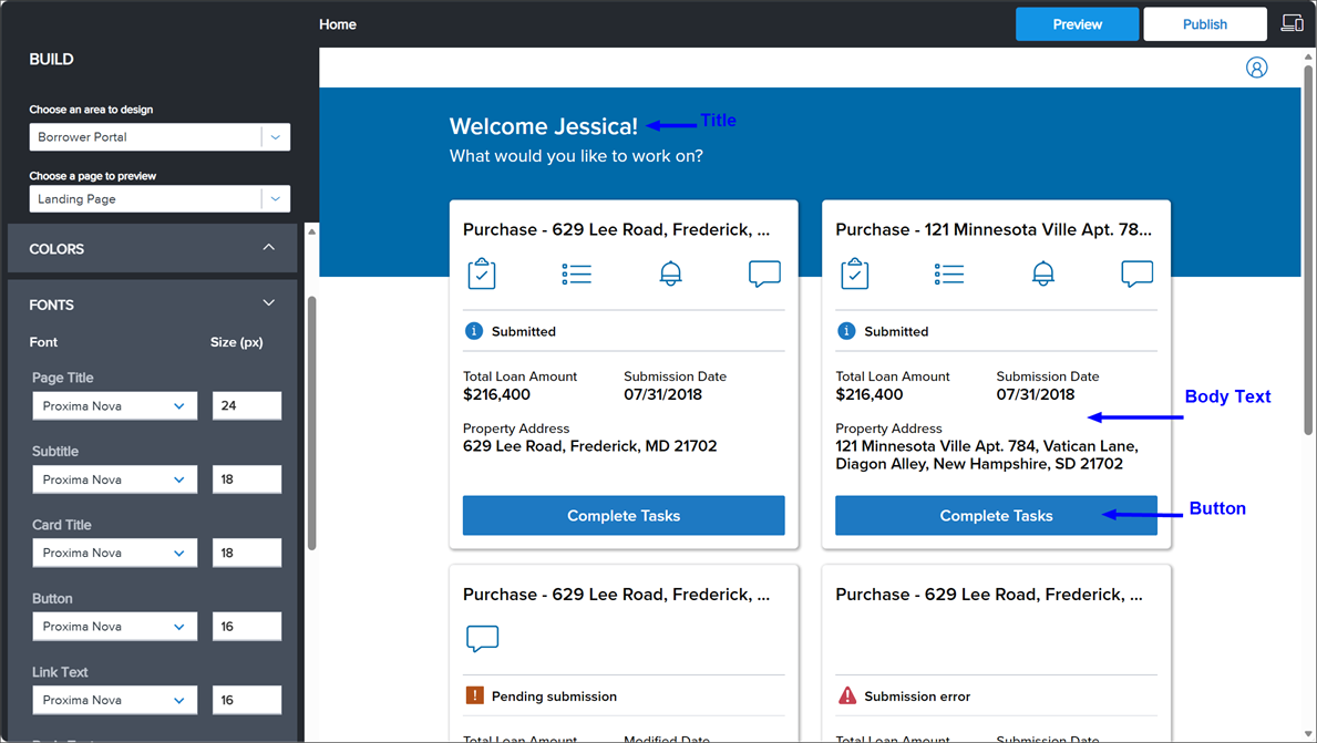
To Select Fonts
-
In Website Builder > Borrower Portal, expand Fonts.
-
In the Fonts section, click the font for each of the page elements:
Option Description Page Title
The font type and font size used for the page title.
Subtitle
The font type and font size used for the section titles.
Card Title
The font type and font size used for the card titles.
Button
The font type and font size used for button labels on loan information cards, tasks, and so on.
Link Text
The font type and font size used for any text that is linked to a URL.
Body Text
The font type and font size used for the body text, including the card titles, status labels, so on.
Notification Message Title
The font type and font size used for notification titles.
Notification Message Text
The font type and font size used in notifications to the borrower.
-
To revert any changes you made back to the default settings, select Reset to Default.
The Reset to Default link will only appear after you make changes.
-
Click Preview to see how the page will look to visitors on your site, then click Publish if you are ready to publish your changes.
Manage Icons
Select the icons borrowers will use to navigate the borrower portal, sign in, create an account, and so on. You can upload and select icons from the Icons configuration menu.
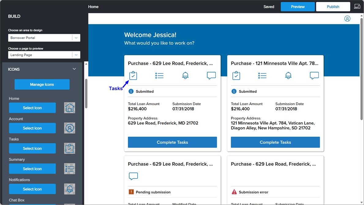
To Manage Icons
-
In Website Builder > Borrower Portal, expand Icons.
-
Click Manage Icons.
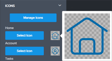
You can hover over an icon to increase the size for viewing.
To Filter and Sort Icon List
When viewing, uploading, or selecting icons, you can filter the available icons by type and file name and sort by upload date.
-
To filter by the icon type, click the Icon Type drop-down and then click the icon type (All Icons, System Icons, or My Icons).
To filter by the file name, click Search (
 ) and type the partial or whole file name.
To sort by upload date, click the Upload Date drop-down.
-
To clear the filters, click More (
 ) and then click Clear Filters.
You can upload an icon using drag-and-drop or browsing. The icon image cannot exceed 10 Kb in size and must be formatted as SVG or PNG.
-
Under Icons, click Manage Icons and then click Upload Icons.
-
To upload files, use one of the following methods:
-
Drag-and-drop the icon image file on the Drop Files area.
-
Click the Local Drive link, browse to and click the file, and then click Open.
-
-
To close the upload section, click Close Upload Section. To close the Manage Icons dialog, click Close.
To Select an Icon
You can select an icon for the icon category (for example, Overview, Rates, or Calendar). When selecting assets that are the System Icons type, you can update the icon color to match the theme of your Loan Application only. To update the color of the System Icons assets, expand the Colors section, click Icon, click the icon color, and then click Save.
-
Under Icons, click Select Icon for the icon category.
The default or currently selected asset is displayed at the top of the list.
-
To select an icon, use one of the following methods:
-
Under Icon Library, select the icon from the list.
-
Under Icon Link, enter the URL of the image file into the Icon URL field.
Linking icons does not save the icon in the icon library.
-
-
Click Apply.
-
To revert any changes you made back to the default settings, select Reset to Default.
The Reset to Default link will only appear after you make changes.
-
Click Preview to see how the page will look to visitors on your site, then click Publish if you are ready to publish your changes.
Edit Message Display Colors
In the Borrower Portal, borrowers receive notifications that provide different types of updates. The Messaging settings control the background color of these messages. To set the fonts color and fonts, refer to Change Color Settings and Choose Fonts.
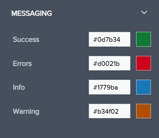
The types of updates include the following:
-
Success Message Example

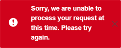
-
Error Message Example
-
Info Message Example

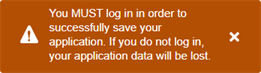
-
Warning Message Example
To Set Messaging Background Color
-
In Website Builder > Borrower Portal, expand Messaging.
-
In the Messaging section, select hex value or color swatch to adjust the color of the message.
-
Under the Custom tab in the color selector dialog, do the following:
-
In the color picker, click the color band and then click the color.
OR
In the RGB fields, enter the Red, Green, and Blue values.
OR
In Hex #, enter the hexadecimal color value, which is a six-digit code of letters and numbers.
-
Compare the Current color and the New Color.
-
Click Save.
-
-
To revert any changes you made back to the default settings, select Reset to Default.
The Reset to Default link will only appear after you make changes.
Configure Navigation in Landing Page and Tasks Page
The Settings section controls the navigation for the Landing Page and Tasks Page.
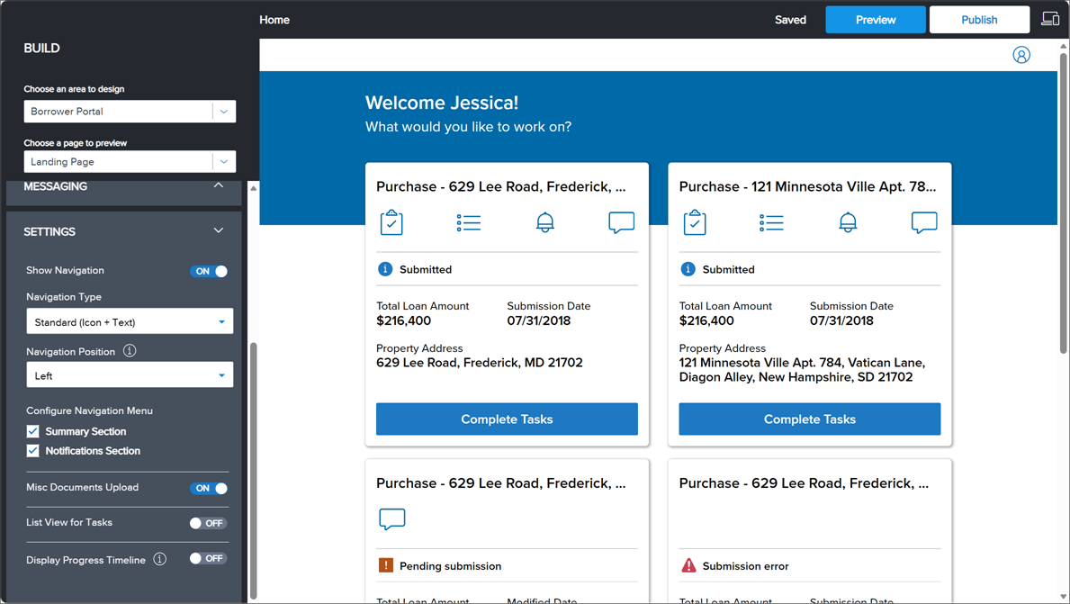
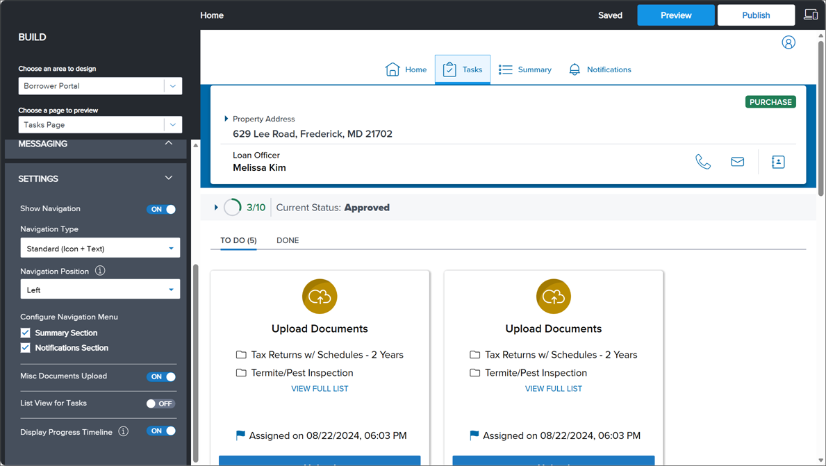
To Update Borrower Portal Navigation in Landing Page and Tasks Page
-
In Website Builder > Borrower Portal, expand Settings and click Landing Page or Tasks Page.
-
To show the Borrower Portal navigation, click the Show Navigation toggle setting to ON.
-
In the Navigation Type drop-down, click one of the following:
-
Standard (Icon + Text): Display the Borrower Portal navigation with both icons and text.
-
Link (Text): Display the Borrower Portal navigation with text only.
-
-
In the Navigation Position drop-down, click one of the following:
-
Top: Display the Borrower Portal navigation on the top of the screen.
-
Left: Display the Borrower Portal navigation on the left side of the screen. If the navigation preview does not display as expected, resize the preview window as needed to see the changes.
-
-
Under Configure Navigation Menu, select the sections to show in the Borrower Portal navigation menu (Summary Section and Notifications Section).
-
-
To hide the Borrower Portal navigation, click the Show Navigation toggle setting to OFF.
-
To show the Back link on the package details page, allowing borrowers to return to the Tasks page, click the Show Back link on package details page toggle setting to ON.
-
To hide the Back link on the package details page, preventing borrowers from returning to the Tasks page, click the Show Back link on package details page toggle setting to OFF.
-
-
To show and activate the additional document uploads on the task page, click the Misc Documents Upload toggle setting to ON.
-
To display the borrower tasks in a list view, click the List View for Tasks toggle setting to ON.
(Default) To display the borrower tasks as individual task cards, click the List View for Tasks toggle setting to OFF.
-
To display loan statuses to the borrower, click the Display Progress Timeline toggle setting to ON. The progress timeline displays your configured borrower-facing statuses, which are directly tied to your Encompass milestones. It shows the status of the borrower's loan along with the number of remaining statuses. The progress timeline's appearance varies on both the Landing page and the Tasks page:
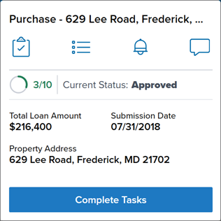
Landing Page Milestones
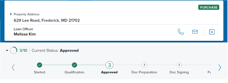
Tasks Page Milestones
Prior to activating, you must set up the milestones to apply to loan files in the Encompass > Settings > Company/Users > Milestones setting, and configure the Consumer Status field in the Encompass Milestone settings. This value displays for the Current Status of the milestone in the timeline when the matching milestone is current. For more information, refer to Milestones in the Encompass help system.
(Default) To hide the borrower progress timeline, click the Display Progress Timeline toggle setting to OFF.