Control
Description
Zip Code Lookup - Design control used to perform a lookup on a zip code value and populate the corresponding city, county, and state loan fields.
Horizontal Slider - Design control used to move groups of controls up or down within a form. Any control that is below the slider will move as the slider moves.
Vertical Slider - Design control used to move groups of controls left or right within a form. Any control that is to the right of the slider will move as the slider moves.
Label - An identifying or descriptive marker that is attached to a control such as a text box or drop-down box.
Hyperlink - Launches a web browser to a specific URL, or executes a custom event handler when clicked.
Image - A graphic, typically in .gif or .jpeg file format, to be displayed on a form.
Panel - Used to group various controls together. All controls placed within the panel are grouped together.
Text Box - Provides a control in which users enter and edit single-line Encompass360 data.
Multi-line Text Box - Provides a control for the user to input multi-line text,such as comments, to be used by Encompass360. When the input text reaches the end of a line it wraps down to the next line.
Dropdown Box - Provides a list of options for the user to select from. The selected option appears in the box.
Dropdown Edit Box - Displays a list of options when clicked. Users can select an option to appear in the box or type an alternative value in the field.
Pick List - Used to create a list of drop-down options.
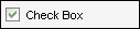
Check Box - Allows the user to select one or more options by selecting the box.
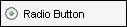
Radio Button - Allows the user to select an option by clicking a button.
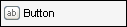
Button - Used to execute a predefined action or a custom event handler.
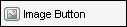
Image Button - Used to execute a predefined action or a custom event handler. To do this, the user clicks an image rather than a labeled button.

Rolodex - Launches the Rolodex (Business Contacts tool) pop-up window and populates one or more Field controls based on the user's selection.
Field Lock - Controls the lock state of a calculated field.
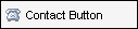
Contact Button - Opens the Conversation Log worksheet for the contact with which it is associated, and populates it with data from the form.
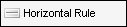
Horizontal Rule - Displays a horizontal divider and is used to accent the horizontal border of a category box or other section of a form. It can also be used as a separator between sections.
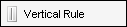
Vertical Rule - Displays a vertical divider and is used to accent the vertical border of a category box or other section of a form. It can also be used as a separator between sections.
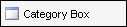
Category Box - Used on forms to designate a section such as Borrower Information or Credit Information. By default, it is designed to match the look and feel of Encompass360 forms.
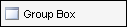
Group Box - A second level header which typically appears inside a category box directly under a section header. By default, it is designed to match the look and feel of Encompass360 forms.